I have two thermostats (dual zone, single furnace). I would like to see a graph that shows the combined (single furnace) usage. It would combine both both zones (thermostats) in one graph. That way I could see if I was efficiently heating/cooling my house, and get a better idea for setting schedule, sensor usage, and possibly even duct dampers to maximize heating/cooling. As an example, I know that when the upstairs zone is calling for “cool”, the cool falls to the lower level, and the “downstairs” thermostat should be probably be adjusted accordingly. Having a dual graph may help get everything adjusted better by giving me a complete picture of settings and temperatures over time. I want to maximize my two zones (thermostats) against the single furnace they are attached to.
This has been a point of discussion for a while and is not something I have made much progress on. I’ve received a lot of good feedback and do intend on addressing this at some point. I don’t have any timeline on when I might get to this, though.
k1n6b0b commented on Jan 28, 2019
I second this! I assume because I have multiple zones on my boiler that this drastically affects the “efficiency” shown when only considering a zone independently?
acesarewld commented on Feb 3, 2019
Giant +1 to this as well. Just got 4 EcoBee’s installed and the data I can collect is awesome, but I don’t have a way to see it ALL in one place at once time
ziebelje commented on Feb 4, 2019
@k1n6b0b The beestat Home Efficiency chart is based on each individual thermostat. The 1.3 update (coming soon…) fixes that by grouping thermostats by physical address.
@acesarewld or anyone else…would love some feedback on exactly how you would prefer to see this data aggregated. Do you want one chart per thermostat? Somehow group all thermostats into a single chart? Something else entirely?
acesarewld commented on Feb 22, 2019
@acesarewld or anyone else…would love some feedback on exactly how you would prefer to see this data aggregated. Do you want one chart per thermostat? Somehow group all thermostats into a single chart? Something else entirely?
Thanks for writing back! I meant to send this sooner – but with EcoBee being DOWN for the last 2 weeks I’ve been trying to adjust my system with very minimal data to work from.
Anyway, I’d like something of a whole-house dashboard, like Home Assistant https://www.home-assistant.io) provides but FAR FAR FAR LESS COMPLICATED!
So a bulleted list of ideas for what I was looking for includes:
• Dashboard view with all thermostats and sensors connected to them
• AJAX-style auto-update and auto load when new data is available
• Scrolling left/right of graph data like HomeIQ page has (I know using highcharts may prevent this)
• Ability to see all thermostat data at once (a whole-house view)
-Is a single graph with all data (minus redundant data like outside temp) the correct answer?
-Is a stacked set of graphs per-thermostat a better implementation?
• Mouse-over icons should have tooltips explaining what the icons mean
Ultimately the dashboard for my 4 thermostats should include things like runtime since 12:00AM that day, current temps, current humidity, and what equipment is running [and why it is/isn’t running — recovery? temp trigger? away mode? etc…]
It may be nice to have something we could install/host ourselves to alleviate pressure on your servers and hosting capabilities as well.
Anyway, these were just some basic thoughts – your service is GREAT and thank you for offering it to us!
I just want to second this as well. I have 3 thermostats in my home and it would be extremely helpful to be able to see combined usage. Perhaps start with something simple like a chart that just combines the runtimes? That alone would be very helpful to see how much my system is running as a whole.
+1 for this feature. 2 story house in the desert… the biggest issue in the summer is balancing the 2 thermostats. Additionally (different feature request) would be to find and alert the unbalanced situation somewhere under the ‘analyze’ button.
It would be extremely useful if we could see a simple view that shows the run time for each unit over a given time period. Both in time and percentage. Bonus would be to include something that indicates a change month over month or week over week.
I recently found that one of my units is performing poorly. Initially it was just me looking at the temp and thinking “Hmmm, it should be lower”, then I used beestat to look at the run time in the Thermostat Detail graph. But a simple chart of run time would be very useful for me to be able to see if a unit is running more than usual.
Great app - joined just to add comments that I also have a multi-zoned system that I currently use home assistant to overlay the important metrics of my zones, but it’s not nearly as easy to use as this (or pretty, by default anyways).
As a side note for those that want to balance - I was able to do some cool logic in home assistant to give preference to specific zones based on my observations/needs - eg. if heat comes on, at night, on bedroom floor and livingroom floor, give heat to the 2nd floor first (turn off first floor), otherwise it would be so slow (undersized system…) that it may never catch up, or it would get first floor to temp, and then heat second floor, as more heat came to 1st floor bringing it over temp even
Also new here and this feature would be immensely helpful in my situation.
My home is a green certified 2.0 built home but also has a good amount of sq feet to condition with some high ceilings. Individual thermostat graphs are nice, but the true value of the data is hidden and not easy to see due to all the zoning. Zones are driven by ecoJay controllers.
My Setup (8 bee’s):
- Upstairs as 5 zones (one per bedroom) which runs off a single system (2.5ton)
- Main level and lower level as 2 zones run on a single (3.5ton). The main level has some tall open air two story rooms that mix conditioning with the upstairs.
- Inlaw quarters with a single zone on a single system (2 ton)
As you would imagine, looking at one thermostats data isn’t very helpful. Would love to be able to actually understand the efficiency of things as a home/system rather than zones.
Also this feature request which was recently “Closed” because the data can be derived from “Temperature Profiles” but unfortunately that only applies if you have a single zone/system. Would love to be able to “combine” data from multiple thermostats.
Based on temperature profiles, project temperatures where HVAC equipment would no longer satisfy demand
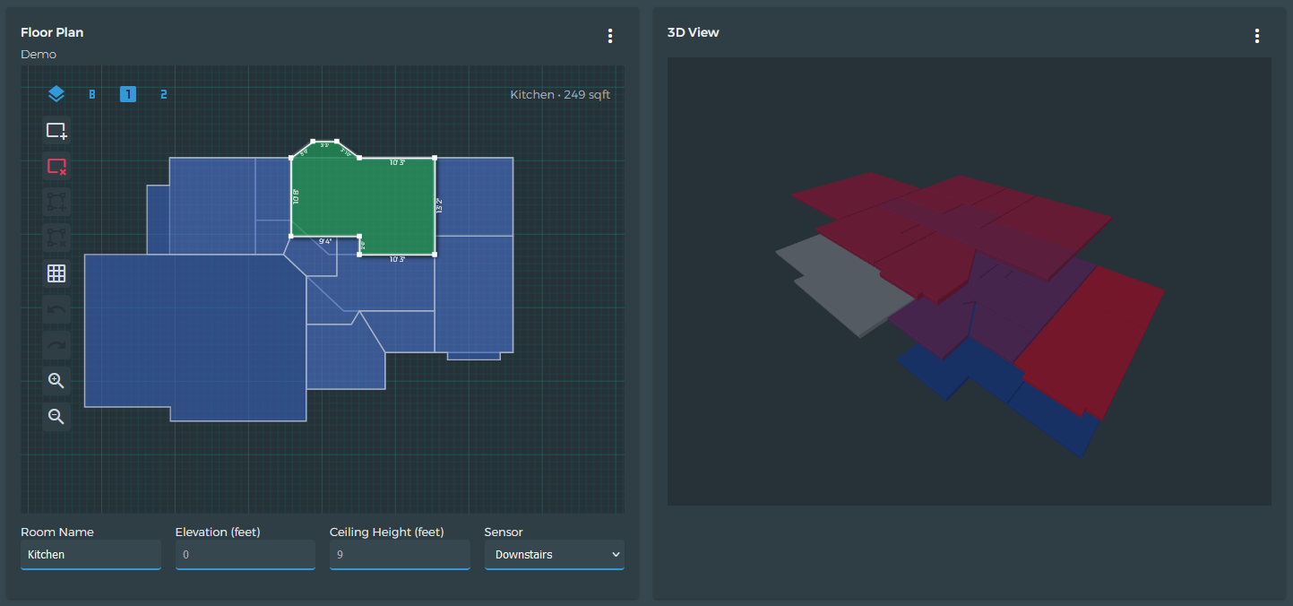
Hi! Thanks for your detailed feedback. Multi-zoned systems have definitely taken a backseat in beestat. You might be interested to know that the newest feature does not have that limitation. I included a screenshot below. It’s still a WIP but Patreons will have early access to much of this next week. You’ll be able to view sensor data in 3D and choose from any sensor, not just those attached to the current thermostat.
I would definitely like to bring the same flexibility to the other charts. Make sure you give this topic a vote up top as that helps drive what I spend my time on.
+1. We have an older home that has a couple of additions and, as a result, multiple, somewhat awkwardly connected zones. It would be great to be able to visualize temperature fluctuations as well as the time the heating system was running across all zones (all zones share a central boiler).