I now have seven sensors, & on the sensor graph, the yellow (color #3) seems a bit too close to orange (color #5) to easily distinguish. Perhaps a little less red in the color?
Yeah I can probably adjust things a bit. At some point there’s not much that can be done as everything will just run together regardless, but I don’t think it’s unreasonable to adjust some of the early colors for best contrast.
Here’s the current color sequence:

And here’s the official feature request:
This is a very difficult task to do with the possibility of 32 sensors! One thing you could do, is allow the user to create groups of sensors, that a user could turn on & off with a single click, like you can currently do at the bottom of the graph for echo individual sensor. Each group would represent a collection of sensors (overlapping allowed) that he/she could enable or disable at a time, allowing easy comparisons of just a few sensors at a time.
And/or:
Since the sensor graph page has only one graph, use the above groups to create multiple graphs on that page.
Migrating a few comments from:
amabirts commented on Nov 2, 2020
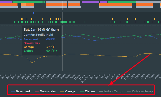
When viewing on the SENSOR tab, is there a way to have the sensor name the same colour as the sensor line/marks on the graph - rather than just white?
amabirts commented 3 days ago
I was thinking more along the way the floating box has the sensor name in the same colour as the line. Perhaps that could be mirrored with the key?
ziebelje commented 3 days ago
I believe this is possible to do with the charting library I use. I’ll have to play around with it to see what can be done.
I had previously ordered my sensor name prefix in the Ecobee app, so that the colors were assigned to the sensors in Beestat in a manner I liked (brighter colors for the warmer rooms).
I recently renamed the thermostat, & that effectively re-ordered the colors for the sensors recently. Accordingly, I have renamed my sensor names (& moved the sensors around in my house) so that I retained the color scheme I liked for my rooms.
Suggestions:
-
Provide an easy way to set color preferences (requires quite a bit of work, I realize).
-
Show the colors for the sensors in the sensor listing at the top (easy).
Re color scheme adjustments… pls consider a white background - to help with printing a screen capture. Large areas of dark colors don’t print well.
I only want to print occassionally - and can use a marker to highlight the data/plots.
My printer is laser so no color anyway.
Thank You
1 Like
Received request to customize chart colors as well. Merging that with this request. Eventually this will be a user-configurable setting.
1 Like