Greetings, I’m a new user of beestat. I appreciate the data charts and the precision of the lines. One of the main problems with ecobee’s rudimentary dashboards is that the values are rounded which can often cause misinterpretations of the underlying data.
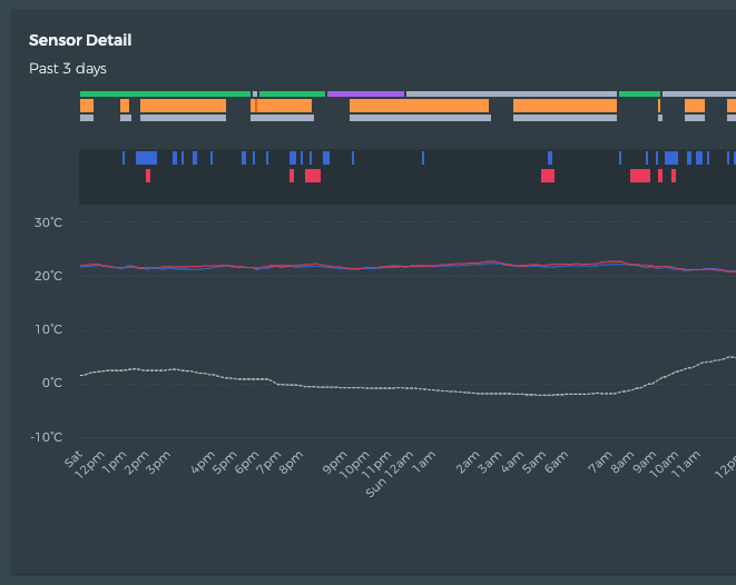
With beestat’s charts, I find them to be not tall enough - the graph area is compressed vertically. So although the data is more precise, the way it is rendered on-screen doesn’t leverage the underlying precision. Example: trying to view sensor temperatures and outdoor temperature at the same time. Movement in the line is difficult to see due to vertical compression.
This is always an issue in the Winter when the indoor and outdoor temperatures start to really diverge from one another. You can kind of fix it by disabling the Outdoor Temperature series, but then you obviously can’t see that data.
I’m not sure the best solution for this at the moment. I could move Outdoor Temperature to it’s own secondary axis, but then you lose the ability to actually see how indoor and outdoor temperatures relate. Making the chart taller would get you a bit more detail, but I’m not in love with that solution either since it requires performing an action to actually see the data.
Definitely open to further ideas and discussion on this one. You’re not the only person who experiences this.
I would ask: what is the reasoning behind the current design - more than one slim chart on the same page?
If you don’t want to make major changes (e.g. having each chart on its own, dedicated tab), a fullscreen option (overlay on page) for each chart would do the job and not affect the existing experience.
I agree that two different temp axes wouldn’t be a good solution.
I think it’s nice to compartmentalize things a bit. Beestat is organized to group similar things together. If I gave each chart it’s own page, the first request would probably be “How do I add more than one chart to a page?”
I don’t hate the idea of having an enlarge/fullscreen option for the charts. For me, the downsides are:
It’s extra work to support this secondary view of the chart. Sizing is mostly automatic, but there are some hardcoded heights in there to keep things looking nice.
It’s an extra click to make the chart readable when the indoor/outdoor temps diverge a lot. I don’t believe users should have to perform a secondary action just to view the data.
Upsides:
It’s an idea, and I currently have no other ones.
It would help add some resolution to the chart so you can better see the fluctuation in indoor temperature.
I’ll give it some more thought and see if I can come up with anything.
Hey again @ziebelje I think I am going to change my mind about the secondary axis! This actually might be the best option, since it will be easier to see the relative movement of indoor and outdoor temperatures. It could be an option in the settings so that the current experience wouldn’t be affected.