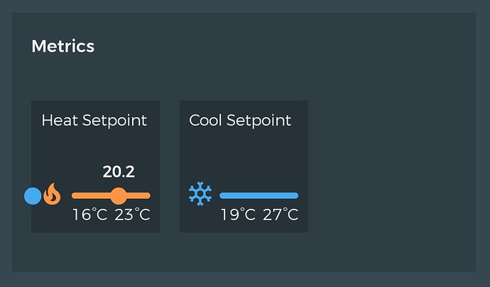
When using Beestat on mobile, the new experimental metrics screen is very compact and difficult to read. I would suggest that on small displays, each graph should have its own line and take the full width of the screen.
1 Like
I agree. Rotating my phone makes them look better. Although they’re still on the same line, they’re much more readable.
Also, the experimental graphs are currently on hold.
Yeah that looks pretty bad. Whoever made them did a terrible job.  I’ll make sure all that gets cleaned up.
Thanks @tag for jumping in to comment!
1 Like
No longer an issue with the new design.

