Hello, thank you for the awesome work on beestat! I love using this tool to try to optimize my house thermostat settings, while staying comfortable. I know this can be done by downloading the data as a CSV and doing some math on Excel, but I think it’d be really helpful if there was a chart, just X-Y table, or actual graph, that had the runtime hours that the heat/AC was on, and if possible, relate it to the outdoor (or indoor setpoint) temperature, for an entire day/week/month, etc.
Assuming that the weather doesn’t change. My goal is to look at beestat and quickly see that the furnace was on for 100 hours this week. I then go make a change in the thermostat. Run the furnace for another week. Go back to beestat and check the runtime, e.g. it was 120 hours this week, so the change that I made made the furnace run more.
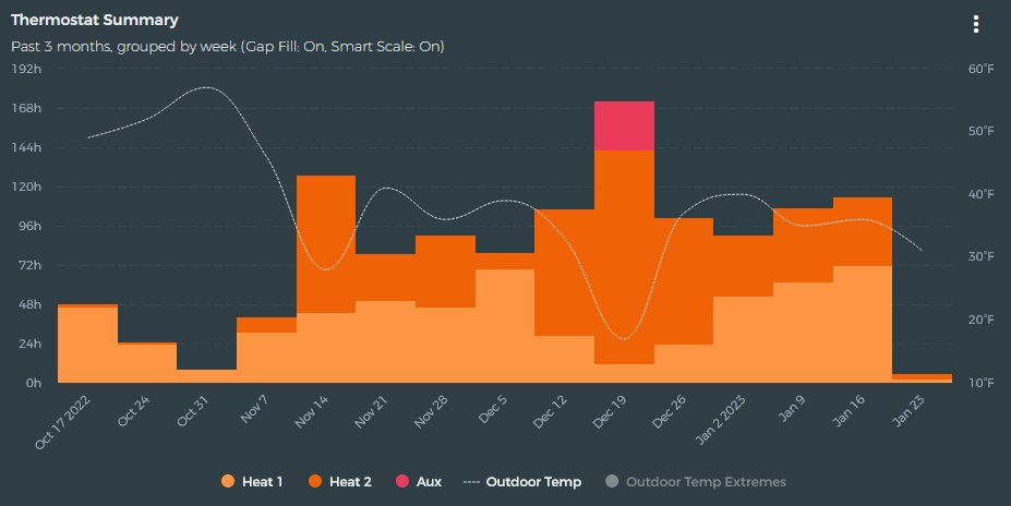
This is actually possible on the Runtime Summary chart. Just use the dropdown on that chart to choose a custom range. The popup will let you group the data however you want.
Am I able to download data on a month summary?
Tried downloading the CSV but that’s on a 5 min basis. I am trying to compare my monthly gas usage vs total run time per month by loading this into an excel sheet.
This won’t work for the high-resolution data. The Runtime Summary chart only has the daily aggregated data. You can download the high resolution data from the main menu in the top right.