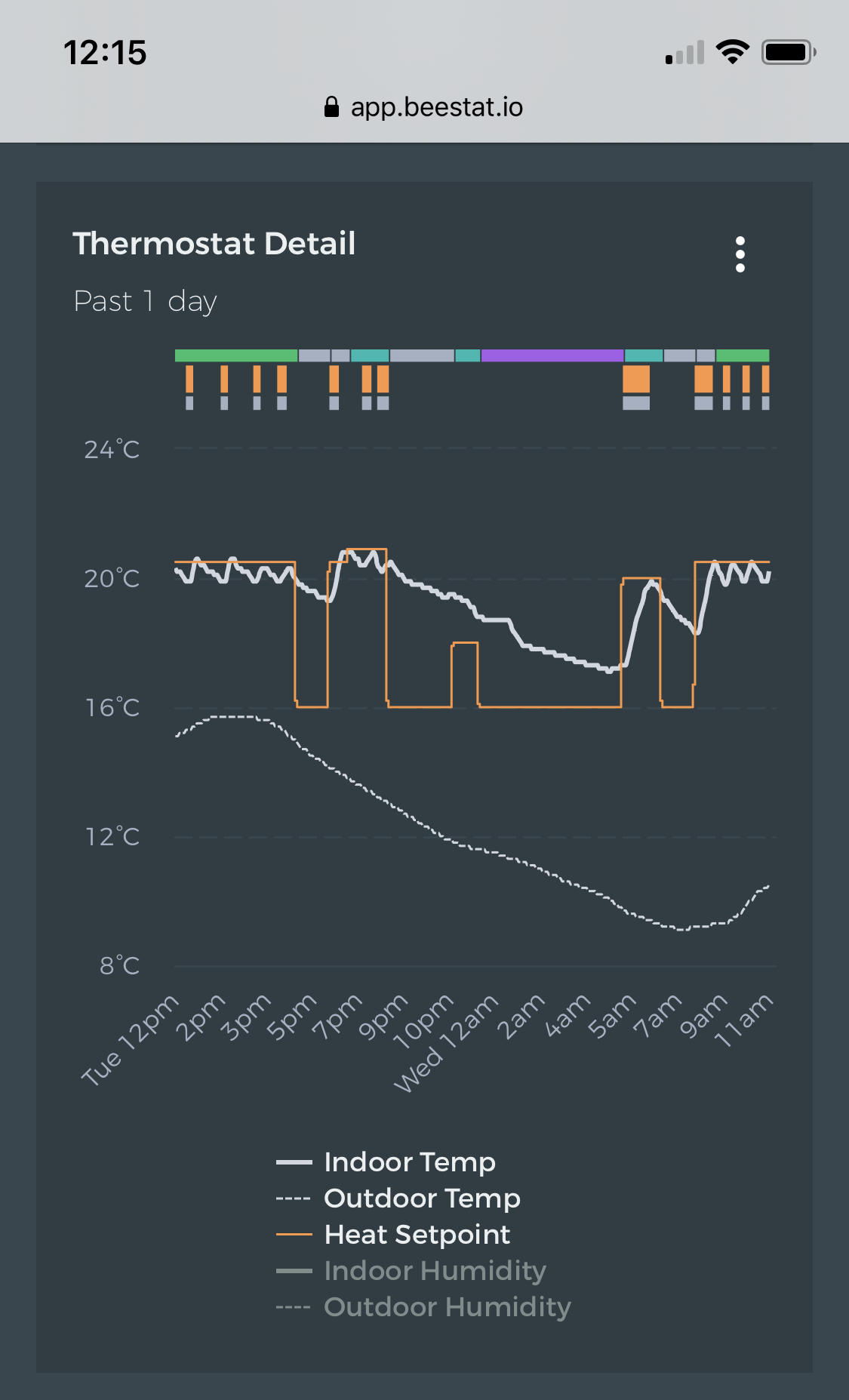
This scale shows meaningful changes in the indoor temperature in relation to outdoor temperature and runtime.
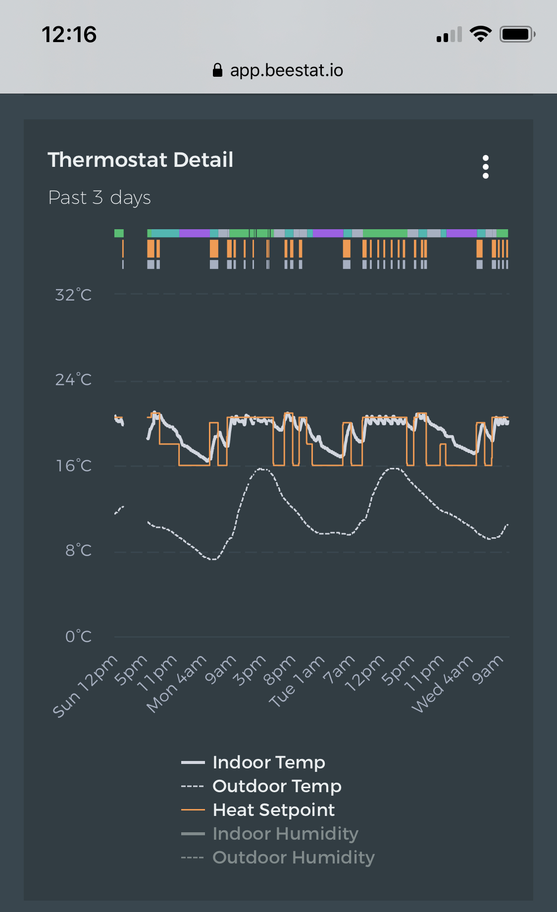
If I change the view to “Past 3 Days”, suddenly the scale changes to 0°C - 32°C, despite the fact that neither the indoor nor outdoor temperatures got below 7°C or above 21°C. Suddenly, the graph is much less useful as you can’t see much variation in temperature.
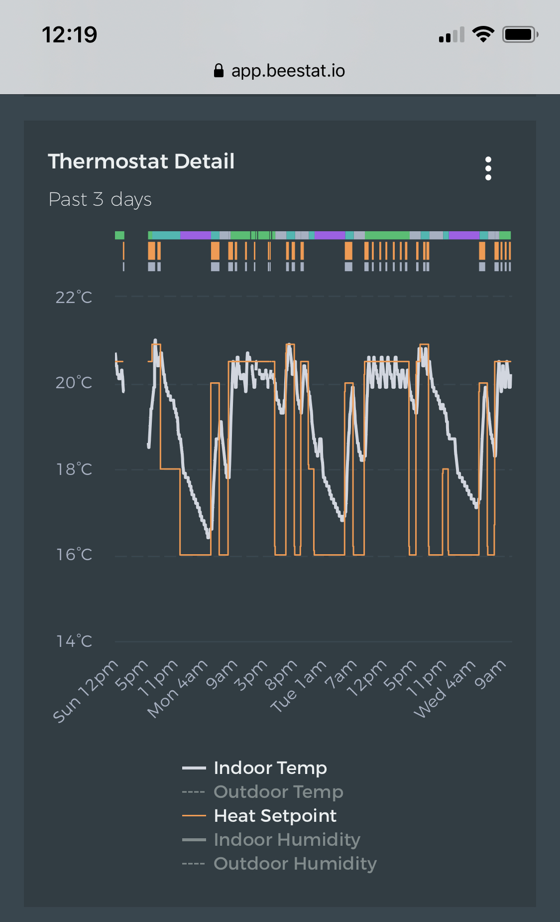
But, if I remove the Outdoor Temperature line from the plot, suddenly the scale reverts back to showing a range of 14°C - 22°C. This is far more useful!
It seems the Outdoor Temperature plot causes the scale to widen by “too much”, ie there’s too much buffer or padding to allow for colder and hotter temperatures that never actually happened in the displayed time period.
Can the logic be adjusted such that the scale is kept as tight as possible? In my example, the 3 day plot should ideally have a scale between 6°C - 22°C.
This can probably be tweaked a bit. Sometimes the auto-scaling can be a bit silly. In this case the chart chose to have a tick every 8°C. On Monday the outdoor temperature dropped just below so it expands out another 8°C. Not sure why the chart didn’t cap at 24°F though. I’ll take a look.
I’ve seen this too, & at first I though it was an outlier data point, but that doesn’t seem to be it.
I argue for a more dynamic, constrained auto-scaling, which would make it easier to see minor changes in the graphs. “White space” is useful on text & some web pages, but not so useful in graphs.
I have a similar problem. When adding outdoor temperature, it expands the the temperature range symmetrically up and down even though the outdoor temp is always way above indoor temp. It seems to be trying to keep the median of the indoor temps and setpoints in the middle of the range even when the outdoor temp is very different.
Hey Jon, just wondering whether there’s any movement on this issue? Scales continue to be a bugbear, especially with outside temp ruining any level of data detail by squishing the scale into nothing. Thanks!
I just thought I’d share this one too. I’m not sure why but the autoscale for the graph makes it extend that far. Would it be possible to move the outdoor temp to the right-hand side of the graph along with humidity and separate the indoor/outdoor scales so it can plot a narrower range for indoor temp?
I’ve temporarily given up on this. I don’t have any great solutions. The real problem is that charts with multiple axis don’t do what you want them to when you have multiple axis enabled. I can move outdoor temperature to the right side…except humidity is already there so then it’s just a third axis which is going to be incredibly confusing. Open to suggestions.
One thing I’ve run into with the thermostat detail graph is that adding the outdoor temperature locks the range to 0-120F, which compresses the indoor graphs to nearly a straight line. I’d love to see the Y axis autoscale for outdoor, like it does for indoor temperatures. The humidity graph would also be cool to autoscale.
Moved this back to feature requests. I posted an update on GitHub after doing some investigation. This isn’t really a bug I can fix; I’ll have to come up with some completely different way to address this but so far I’ve got no great ideas. Open to discussion!
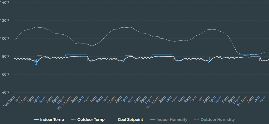
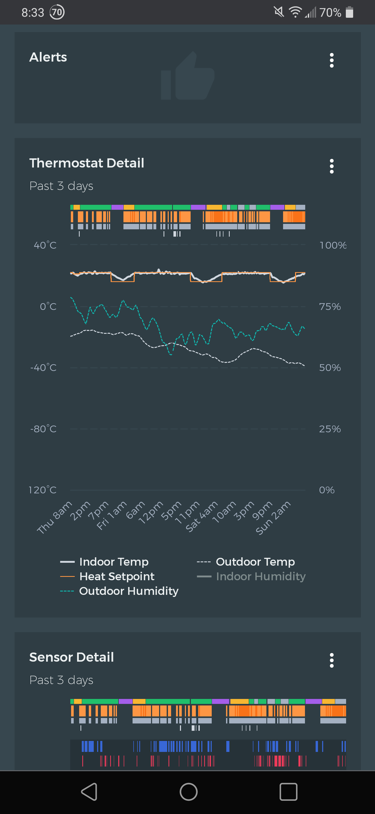
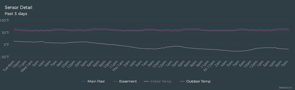
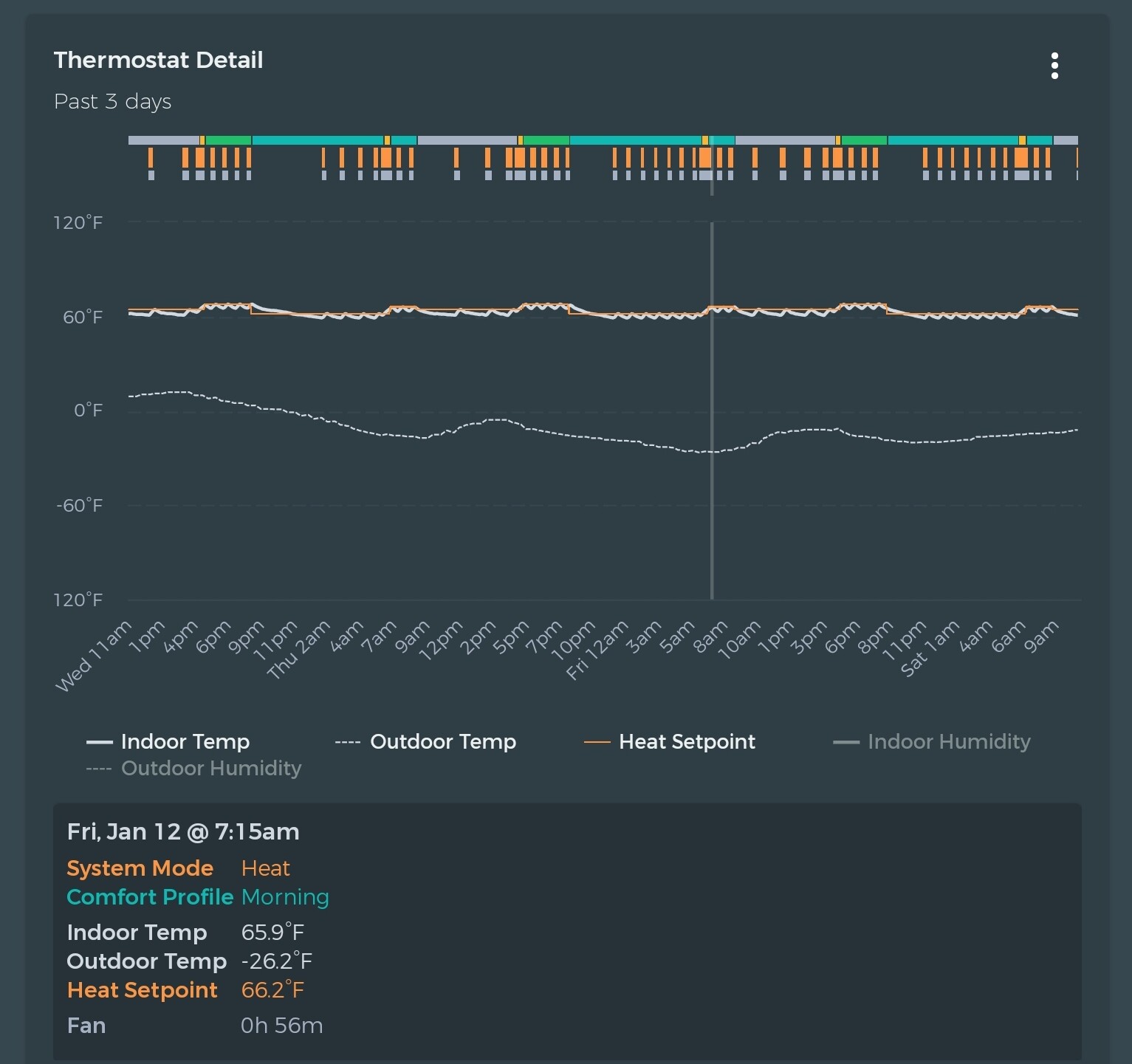
Could the auto scaling of the temp axis for the Thermostat Detail graph be modified to provide more resolution when looking at larger indoor-outdoor temperature differentials? Example below for when the scale goes to 120 to -120oF. The Sensor Detail for the same period auto scales to 100 to -50oF, which still limits the visual resolution.
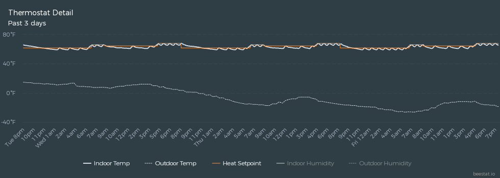
Sorry, I just realized the downloaded chart of the Thermostat Detail doesn’t show the larger scale I referenced. The screenshot below shows what I am seeing in the app, which seems to rescale when downloading the chart. I realize even a tighter scale isn’t going to show much detail over this temperature range from indoor to outdoor. Thanks.
Played around with this a bit more - in some cases it may work to use breaks in the axis to collapse the unused space. Doesn’t work for all situations, and I need to update the charting library to take advantage.