Migrated from:
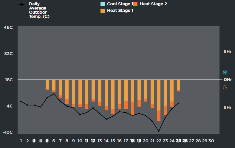
Is it possible to show the heating graph values as negative numbers so they have a correlation to the outside cold temperatures. Currently in the aggregate graph, if the temperature goes down, the amount of heating goes up. Visually it would be more helpful to have these in the same direction for correlation.
This is done on Ecobee IQ graphs for Weather Impact.

ziebelje commented on Dec 1, 2018
I see your point but I’m reluctant to make this change because then the chart implies negative heat usage. It’s weird and I specifically designed mine the opposite way that ecobee has it.
I’ll see if I can come up with any other ideas to help make temperature comparisons easier.
FrankXLT commented on Dec 12, 2018
Agreed. I am not sure ecobee understands data analysis anyway.
ziebelje commented on Jan 17, 2020
I may do this yet, but if so it’ll be a configurable thing.