Getting this feature request going. Tooltip on charts especially on mobile can be a bit difficult to work around.
From an email:
One question: Is it possible to make the location of the data boxes optional–either fixed, draggable, or on one or the other side of the cursor? Currently, the data box almost always obscures the trend we are trying to examine–we have to move the cursor back and forth to get box out off half the data at a time
First off, great apps! My kudos to the developers!
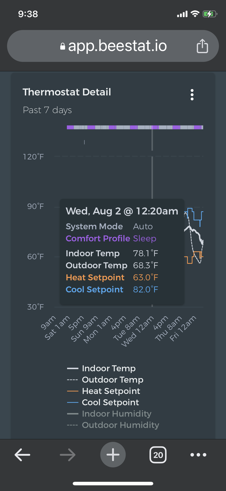
In the thermostat details section, when one attempts to navigate the cursor in the chart, the block of displayed data obscures a good part of the chart, and the block moves with the direction of navigation which makes it difficult to see where the cursor is on the chart. I have included a screenshot to illustrate the issue. It would be great if one could undock the data block and move it to somewhere on the screen where it’s less obstructive. I noticed this issue also when accessing the app from a chrome desktop browser.
Yeah I’ve had this complaint a few times. I’ll have to think of a nice way to address this. If you have used any other apps that handle this gracefully let me know!
Good morning! Some apps have the concept of docking and undocking a view. Undocking a view allows the user to reposition the view to other areas in the screen. I think this may work well to address this issue.
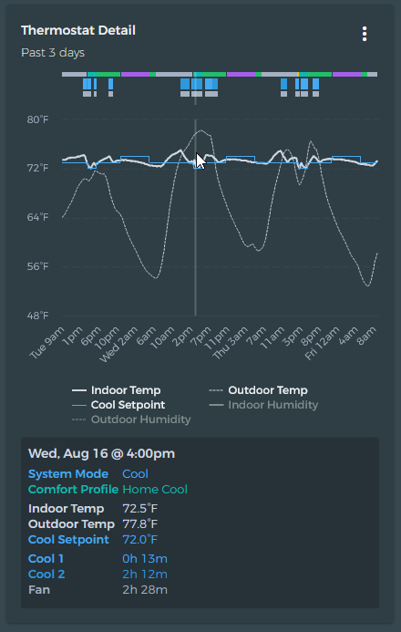
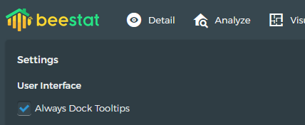
Try the latest update. On mobile, it should now dock tooltips under the chart by default. You can go into the settings screen and enable them on desktop if you like as well.
Good morning! The change in the latest version looks great👍! The display works well on my iPhone X and I can see the data along with where the cursor is on the chart.
Thank so much for taking the time to make the improvements so promptly!